Alerts tend to be for sticky messages that I want to ensure the user must actively engage and dismiss. Toasts, on the other hand, are used for quick, something-happened style messages - the information is there for the user to pay attention to, or not, as the message will disappear on its own in a few seconds.
MVP#
The process for showing toast messages is nearly identical to the alerts pipeline, so I am going to start off with a minimum-viable-product approach to verify the dispatch, show, and remove functionality.
Interface#
For this first pass I am just looking to display some text, and of course we will need a unique id for testing and state cleanup. I chose to name the interface IToastMessage over simply IToast as I have previously run into a naming collision with another package, so in this instance I chose to be ultra-specific.
file: /src/@interfaces/IToastMessage.ts
interface IToastMessage {
  id: string;
  text?: string;
}

export default IToastMessage;Slice#
We only need actions to display it, and remove it for now:
file: /src/store/slices/toasts.ts
import { createSlice, PayloadAction } from '@reduxjs/toolkit';
import { v4 as uuid } from 'uuid';
import IToastMessage from '../../@interfaces/IToastMessage';
import { IStore } from '../';

const initialState: Array<IToastMessage> = [];

export const toasts = createSlice({
  name: 'toasts',
  initialState,
  reducers: {
    removeToastMessage: (state: Array<IToastMessage>, action: PayloadAction<string>) => {
      const index = state.findIndex(t => t.id === action.payload);
      if (index > -1) {
        state.splice(index, 1);
      }
    },
    addToastMessage: {
      reducer(state: Array<IToastMessage>, action: PayloadAction<IToastMessage>) {
        state.push(action.payload);
      },
      prepare(text: string): any {
        return { payload: { id: uuid(), text } };
      },
    },
  },
});

export const { addToastMessage, removeToastMessage } = toasts.actions;

export const selectToasts = (state: IStore) => state.toasts;

export default toasts.reducer;
Toasts Container#
The container is really simple since Bootstrap’s live example demonstrated a nice set of default classes to wrap a stack of toasts:
file: /src/components/app/AppToasts/AppToasts.tsx
import React, { FC } from 'react';
import { useAppSelector } from '../../../helpers';
import { selectToasts } from '../../../store/slices/toasts';
import Toast from './AppToast';

const AppToasts: FC = () => {
  const messages = useAppSelector(selectToasts);

  return (
    <div className="toast-container position-fixed bottom-0 end-0 p-3">
      {messages.map(message => (
        <Toast key={message.id} toastMessage={message} />
      ))}
    </div>
  );
};

export default AppToasts;
Toast Component#
Here we come to the primary difference between Bootstrap’s toasts and their alerts - toasts are exclusively opt-in
so you need to explicitly invoke the show method for the component. Again just the bare minimum for the toast itself:
file: /src/components/app/AppToasts/Toast/Toast.tsx
import React, { FC, useEffect, useRef } from 'react';
import { Toast as BSToast } from 'bootstrap';
import IToastMessage from '../../../../@interfaces/IToastMessage';
import { useAppDispatch } from '../../../../helpers';
import { removeToastMessage } from '../../../../store/slices/toasts';

export interface IAppToastProps {
  toastMessage: IToastMessage;
}

const Toast: FC<IAppToastProps> = ({ toastMessage }) => {
  const ref = useRef<HTMLDivElement>(null);
  const dispatch = useAppDispatch();

  useEffect(() => {
    const handleClose = () => {
      dispatch(removeToastMessage(toastMessage.id));
    };
    const el = ref.current;

    el!.addEventListener('hide.bs.toast', handleClose);

    // NOTE: unlike Alert, Toast is opt-in so you need to explicitly
    //       initialize it here.
    const toast = new BSToast(el!);
    toast.show();

    return () => {
      el!.removeEventListener('hide.bs.toast', handleClose);
    };
    // eslint-disable-next-line react-hooks/exhaustive-deps
  }, []);

  return (
    <div ref={ref} className="toast" role="alert" aria-live="assertive" aria-atomic="true">
      <div className="toast-header">
        <strong className="me-auto">Alert</strong>
        <button
          type="button"
          className="btn-close"
          data-bs-dismiss="toast"
          aria-label="Close"></button>
      </div>
      <div className="toast-body">{toastMessage.text}</div>
    </div>
  );
};

export default Toast;
We’ll tuck the container in beside the AppAlerts container in the startup component:
file: /src/index.tsx
import { createRoot } from 'react-dom/client';
import { RouterProvider } from 'react-router-dom';
import { Provider } from 'react-redux';
import 'bootstrap';
import AppAlerts from './components/app/AppAlerts';
import AppToasts from './components/app/AppToasts';
import './styles/global.scss';
import store from './store';
import routes from './routes';

createRoot(document.getElementById('root') as HTMLElement).render(
  <React.StrictMode>
    <Provider store={store}>
      <AppAlerts />
      <AppToasts />
      <RouterProvider router={routes} />
    </Provider>
  </React.StrictMode>,
);
Test Page#
Let’s add a new button to our notifications test page so that we can verify everything works:
file: /src/index.tsx
/* istanbul ignore file */
/* This is just an homely little demo page and is meant to be removed from a real project */
import React from 'react';
import { useAppDispatch } from '../../helpers';
import {
  addErrorAlert,
  addInfoAlert,
  addSuccessAlert,
  addWarningAlert,
} from '../../store/slices/alerts';
import { addToastMessage } from '../../store/slices/toasts';

const NotificationsDemo = () => {
  const dispatch = useAppDispatch();

  // alerts
  const handleInfoAlert = () =>
    dispatch(addInfoAlert({ title: 'Optional Title', text: 'This is purely informational' }));

  const handleSuccessAlert = () =>
    dispatch(addSuccessAlert({ text: 'very win, highly success' }));

  const handleWarningAlert = () =>
    dispatch(addWarningAlert({ text: 'Turn back, beware of tigers' }));

  const handleErrorAlert = () =>
    dispatch(addErrorAlert({ text: 'You have been eaten by a grue.' }));

  // toast
  const handleToast = () => dispatch(addToastMessage('Yay, something works!'));

  return (
    <>
      <div className="row">
        <div className="col-12">
          <h4>Alerts:</h4>
        </div>
      </div>
      <div className="row">
        <div className="col-12">
          <button onClick={handleInfoAlert} className="btn btn-info me-3">
            Info
          </button>

          <button onClick={handleSuccessAlert} className="btn btn-success me-3">
            Success
          </button>

          <button onClick={handleWarningAlert} className="btn btn-warning me-3">
            Warning
          </button>

          <button onClick={handleErrorAlert} className="btn btn-danger">
            Error
          </button>
        </div>
      </div>
      <div className="row">
        <div className="col-12">
          <h4>Toasts</h4>
        </div>
      </div>
      <div className="row">
        <div className="col-12">
          <button onClick={handleToast} className="btn btn-primary me-3">
            Test
          </button>
        </div>
      </div>
    </>
  );
};

export default NotificationsDemo;
Test Drive#
After verifying that I have no linting errors it’s time to start the app and push our shiny new button. looks very MVP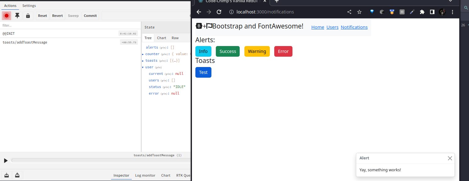
After a few seconds the current storeremoveToastMessage was dispatched automatically by the listener and we can see that the message
has now been removed from the screen: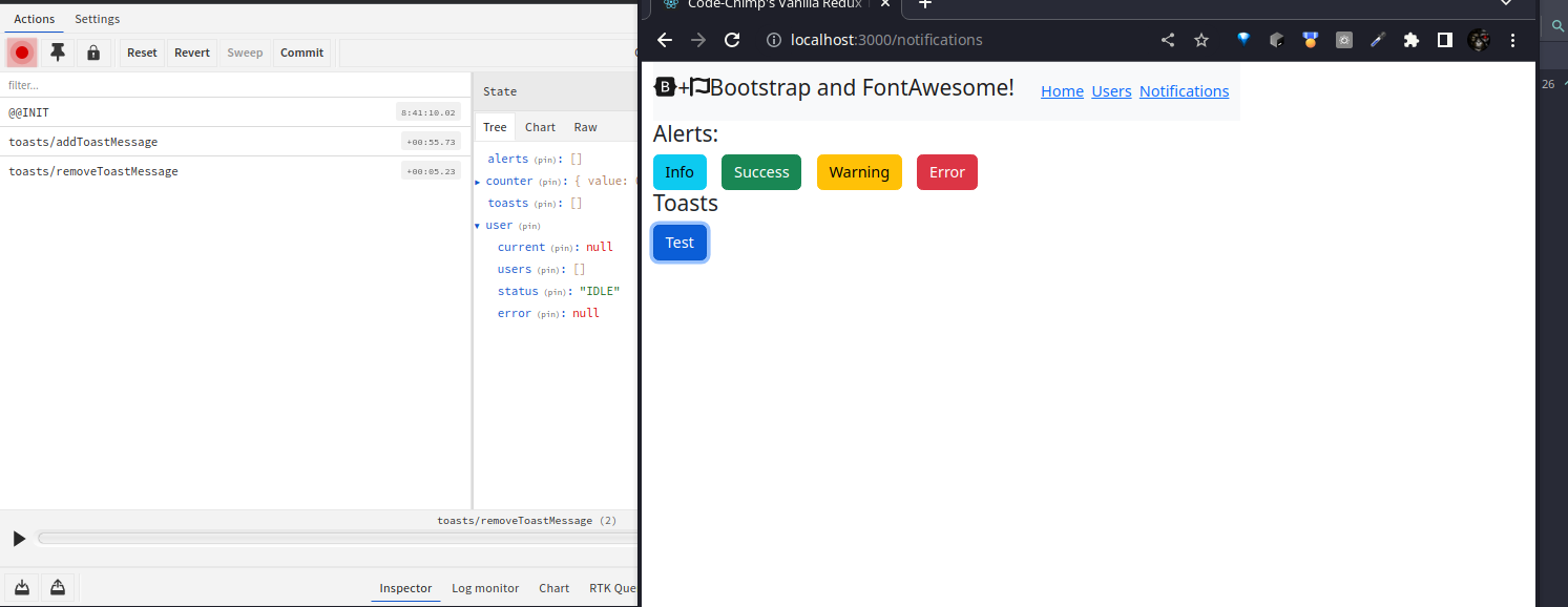

victory
Adding Polish#
I am going to type these similar to the the alerts, with Error, Info, Success, and Warning variants. I plan on leaving the header text non-configurable unless a client requests it.
Typing#
Even though I am using identical values to AlertTypes, this component has the greatest likelihood to sprout more variants
as time goes on, so I feel it best to give the ToastMessage its own separate typing:
file: /src/@enums/ToastTypes
enum ToastTypes {
  Error = 'danger',
  Info = 'info',
  Success = 'success',
  Warning = 'warning',
}

export default ToastTypes;
file: /src/@types/ToastType
import ToastTypes from '../@enums/ToastTypes';

type ToastType = ToastTypes.Error
                 | ToastTypes.Info
                 | ToastTypes.Success
                 | ToastTypes.Warning;

export default ToastType;
Adding the new type to the interface:
file: /src/@interfaces/IToastMessage.ts
import ToastType from '../@types/ToastType';

interface IToastMessage {
  id: string;
  type?: ToastType;
  text?: string;
}

export default IToastMessage;
Slice Changes#
Add actions for our typed toast messages and create a helper method for preparing the payload:
file: /src/store/slices/toasts.ts
import { createSlice, PayloadAction } from '@reduxjs/toolkit';
import { v4 as uuid } from 'uuid';
import IToastMessage from '../../@interfaces/IToastMessage';
import ToastTypes from '../../@enums/ToastTypes';
import { IStore } from '../';

const initialState: Array<IToastMessage> = [];

function createToastMessagePayload(toast: Partial<IToastMessage>): IToastMessage {
  return {
    ...toast,
    id: uuid(),
  };
}

export const toasts = createSlice({
  name: 'toasts',
  initialState,
  reducers: {
    removeToastMessage: (state: Array<IToastMessage>, action: PayloadAction<string>) => {
      const index = state.findIndex(t => t.id === action.payload);
      if (index > -1) {
        state.splice(index, 1);
      }
    },
    addErrorToastMessage: {
      reducer(state: Array<IToastMessage>, action: PayloadAction<IToastMessage>) {
        state.push(action.payload);
      },
      prepare(text: string): any {
        return { payload: createToastMessagePayload({ type: ToastTypes.Error, text }) };
      },
    },
    addInfoToastMessage: {
      reducer(state: Array<IToastMessage>, action: PayloadAction<IToastMessage>) {
        state.push(action.payload);
      },
      prepare(text: string): any {
        return { payload: createToastMessagePayload({ type: ToastTypes.Info, text }) };
      },
    },
    addSuccessToastMessage: {
      reducer(state: Array<IToastMessage>, action: PayloadAction<IToastMessage>) {
        state.push(action.payload);
      },
      prepare(text: string): any {
        return { payload: createToastMessagePayload({ type: ToastTypes.Success, text }) };
      },
    },
    addWarningToastMessage: {
      reducer(state: Array<IToastMessage>, action: PayloadAction<IToastMessage>) {
        state.push(action.payload);
      },
      prepare(text: string): any {
        return { payload: createToastMessagePayload({ type: ToastTypes.Warning, text }) };
      },
    },
  },
});

export const {
  addErrorToastMessage,
  addInfoToastMessage,
  addSuccessToastMessage,
  addWarningToastMessage,
  removeToastMessage,
} = toasts.actions;

export const selectToasts = (state: IStore) => state.toasts;

export default toasts.reducer;
Toast Component Changes#
Adding icons and appropriate tinting to the toast header really makes it “pop”:
file: /src/components/app/AppToasts/Toast/Toast.tsx
import React, { FC, useEffect, useRef } from 'react';
import { Toast as BSToast } from 'bootstrap';
import { FontAwesomeIcon } from '@fortawesome/react-fontawesome';
import {
  faCircleCheck,
  faCircleInfo,
  faCircleXmark,
  faTriangleExclamation,
  IconDefinition,
} from '@fortawesome/free-solid-svg-icons';
import ToastTypes from '../../../../@enums/ToastTypes';
import IToastMessage from '../../../../@interfaces/IToastMessage';
import { useAppDispatch } from '../../../../helpers';
import { removeToastMessage } from '../../../../store/slices/toasts';

export interface IAppToastProps {
  toastMessage: IToastMessage;
}

const Toast: FC<IAppToastProps> = ({ toastMessage }) => {
  const ref = useRef<HTMLDivElement>(null);
  const dispatch = useAppDispatch();
  let icon: IconDefinition;
  let headerText: string;
  // we will add our tint class to this based on type then just
  // `string.join` the array for the header's "className"
  let headerClasses = ['toast-header', ' bg-opacity-25'];

  useEffect(() => {
    const handleClose = () => {
      dispatch(removeToastMessage(toastMessage.id));
    };
    const el = ref.current;

    el!.addEventListener('hidden.bs.toast', handleClose);

    const toast = new BSToast(el!);
    toast.show();

    return () => {
      el!.removeEventListener('hidden.bs.toast', handleClose);
    };
    // eslint-disable-next-line react-hooks/exhaustive-deps
  }, []);

  switch (toastMessage.type) {
    case ToastTypes.Error:
      icon = faCircleXmark;
      headerText = 'Error';
      headerClasses = [...headerClasses, 'bg-danger', 'text-danger'];
      break;

    case ToastTypes.Success:
      icon = faCircleCheck;
      headerText = 'Success';
      headerClasses = [...headerClasses, 'bg-success', 'text-success'];
      break;

    case ToastTypes.Warning:
      icon = faTriangleExclamation;
      headerText = 'Warning';
      headerClasses = [...headerClasses, 'bg-warning', 'text-warning'];
      break;

    default:
      icon = faCircleInfo;
      headerText = 'Information';
      headerClasses = [...headerClasses, 'bg-info', 'text-primary'];
  }

  return (
    <div
      ref={ref}
      data-testid={`toast-${toastMessage.id}`}
      className="toast"
      role="alert"
      aria-live="assertive"
      aria-atomic="true">
      <div className={headerClasses.join(' ')}>
        <FontAwesomeIcon
          data-testid={`toast-${toastMessage.id}-icon`}
          className="flex-shrink-0 me-2"
          icon={icon}
        />
        <strong data-testid={`toast-${toastMessage.id}-header`} className="me-auto">
          {headerText}
        </strong>
        <button
          type="button"
          data-testid={`toast-${toastMessage.id}-close`}
          className="btn-close"
          data-bs-dismiss="toast"
          aria-label="Close"></button>
      </div>
      <div data-testid={`toast-${toastMessage.id}-body`} className="toast-body">
        {toastMessage.text}
      </div>
    </div>
  );
};

export default Toast;
Test Page Changes#
Add some new buttons for the new toast actions:
file: /src/pages/NotificationsDemo/NotificationsDemo.tsx
/* istanbul ignore file */
/* This is just an homely little demo page and is meant to be removed from a real project */
import React from 'react';
import { useAppDispatch } from '../../helpers';
import {
  addErrorAlert,
  addInfoAlert,
  addSuccessAlert,
  addWarningAlert,
} from '../../store/slices/alerts';
import {
  addErrorToastMessage,
  addInfoToastMessage,
  addSuccessToastMessage,
  addWarningToastMessage,
} from '../../store/slices/toasts';

const NotificationsDemo = () => {
  const dispatch = useAppDispatch();

  // alerts
  const handleInfoAlert = () =>
    dispatch(addInfoAlert({ title: 'Optional Title', text: 'This is purely informational' }));

  const handleSuccessAlert = () =>
    dispatch(addSuccessAlert({ text: 'very win, highly success' }));

  const handleWarningAlert = () =>
    dispatch(addWarningAlert({ text: 'Turn back, beware of tigers' }));

  const handleErrorAlert = () =>
    dispatch(addErrorAlert({ text: 'You have been eaten by a grue.' }));

  // toasts
  const handleInfoToast = () => dispatch(addInfoToastMessage('This is purely informational'));

  const handleSuccessToast = () =>
    dispatch(addSuccessToastMessage('You succeeded, give yourself a prize'));

  const handleWarningToast = () =>
    dispatch(addWarningToastMessage('Highway to the danger zone'));

  const handleErrorToast = () => dispatch(addErrorToastMessage('The roof is on fire'));

  return (
    <>
      <div className="row">
        <div className="col-12">
          <h4>Alerts:</h4>
        </div>
      </div>
      <div className="row">
        <div className="col-12">
          <button onClick={handleInfoAlert} className="btn btn-info me-3">
            Info
          </button>

          <button onClick={handleSuccessAlert} className="btn btn-success me-3">
            Success
          </button>

          <button onClick={handleWarningAlert} className="btn btn-warning me-3">
            Warning
          </button>

          <button onClick={handleErrorAlert} className="btn btn-danger">
            Error
          </button>
        </div>
      </div>
      <div className="row">
        <div className="col-12">
          <h4>Toasts</h4>
        </div>
      </div>
      <div className="row">
        <div className="col-12">
          <button onClick={handleInfoToast} className="btn btn-info me-3">
            Info
          </button>

          <button onClick={handleSuccessToast} className="btn btn-success me-3">
            Success
          </button>

          <button onClick={handleWarningToast} className="btn btn-warning me-3">
            Warning
          </button>

          <button onClick={handleErrorToast} className="btn btn-danger">
            Error
          </button>
        </div>
      </div>
    </>
  );
};

export default NotificationsDemo;
Final Test#
The page may be ugly, but the toasts look good! Yeah, Toast!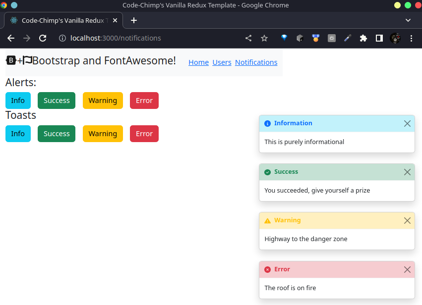
Conclusion#
I am pretty happy with the results and feel this is good enough for a project starter. Team members on projects that I have added these pipelines to seem to like it, and the designers were not completely horrified. Unit tests will be in the repository if you would like some good code coverage to go with the sample code. As always feel free to drop me a line if you see anywhere that could use some improvement.